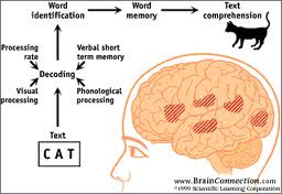
Reading isn't always a straightforward process. There are several steps taken, starting from eyes to the page and ending with comprehension of just what is scribbled on that page and what it means.
There is also no guarantee that what is written will ever be comprehended by the reader or that what is written won't be completely misunderstood.
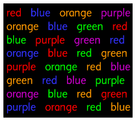
Here is an example of one thing that can go wrong when the brain tries to interpret multiple signals on the same subject. What is read and what is seen get jumbled up as both use many of the same neural pathways in the brain.
Here is another. The brain can either ignore detail it doesn't need. It can also fill in the gaps so editors and writers need to be careful and focused when editing works as simply reading through may not pick up all the mistakes.
The mind sees what it wants to see first and then, sometimes only with prompting, will it see whatever else is available. Personally, I saw "GOOD" before I saw "EVIL" but not because of any identification with either but because I normally read black text and not white. I have a feeling a lot of IT workers will read "EVIL" first as there are a fair number of web pages written in white text.
This is another example of the brain decoding and filling in the gaps. It is also possible to effectively read any section of writing using only the top half of the letters. There are more clues in the top half of the letters than in the bottom half so the mind can effectively fill in the gaps.
All this is important for writers as these highlight not only problem that can occur when conveying ideas, blind spots that can occur when editing and but also some tricks that you, as the writer, can intentionally play to impress your audience.
Designers, particularly of book covers, are able to use such tricks as optical illusions to a greater extent so I will post on that at a later date.


No comments:
Post a Comment