Showing posts with label Books Covers. Show all posts

Saturday, April 21, 2012

On judging a book by its cover

"Don't judge a book by its cover" means "you shouldn't prejudge the worth or value of something by its outward appearance alone".

Writers will claim it is unfair when their books are judged this way.
Hack philosophers and purveyors of 'good will' messages will say you shouldn't.

Instinct overrides it all. We will instinctively judge everything we see on appearances before trying them in any way. Why? Survival depended and still depends on it.


This is smashed cake. Chocolate cake too. Now, do you have any niggling doubts about eating this? Do you wonder why it was smashed, what was used to smash it and whether there are and germs on it now that wouldn't have been before? These are all conscious thoughts related to and justifying your initial hesitation. You might go ahead and say, I don't care, it's all good. You might not but not mind when others go ahead and eat it. Or you might be utterly disgusted by the thought of eating it or others eating it. All are reasonable enough in some way. The poisoned berry does look sweet sometimes and you don't know about poison until you or someone else tries it. Other things like dung and rotten meat look and smell bad to us, showing obvious signs not to get near it and we don't. Many other creatures, dogs definitely excluded, have instinctual negative reactions to such things unless of course it is their food source (dung beetles and flies and vultures).


Books with bad covers look to us like rotten meat. The signs point to nothing much good will coming of eating the rotten meat. 

Bad covers give us signs that there is bad writing within, whether this is accurate or not. Bad covers also let us know that the designer was not in the least inspired about the story. So why should we be. Unfortunately this could just be due to the designer having a lower skill set than his or her competitors.

Still, reasoning aside we will judge the material within by the cover design simply because we always instinctively judge before trying. You cannot stop yourself from doing this, you can only force yourself past it to give the book a try. You may find your initial judgment validated or you may find a gem. There is no guarantee either way.


I believe "You can never tell a book by its cover," as appears in Murder in the Glass Room by Edwin Rolfe and Lester Fuller 1946, is a more applicable saying. This saying doesn't tell you not to judge, just that your judgment shouldn't be given too much weight in the case of books. It isn't likely the book itself will kill you if you touch it or absorb its contents (though in strange cases this might happen when it comes to touch).


Skilled designers and publishers will be aware of the problem and work hard to create enticing book covers, ones that intrigue you and pull you in. They are like flowers, making only sweet promises to the targeted readers.


What makes good book covers?
  • Bright colours appeal to the eye and snag immediate attention. The promise a quick paced read or shocking content.
  • Shading and a stark use of black and white imply intrigue and gritty, tough worlds that will make the reader think on what it is to be.
  • Patterns that appear almost textural and offer the promise of tactile rewards (rarely the ones offered but there is always a tactile reward in holding a book). Patterns also promise complexity within the story.
  • Depth - the use of the small space provided in ways that denotes large spaces, great thoughts or expansive worlds within. This could be the creation of long perspective in landscapes etc, overlaying images to create holes, expanding images past the edge of the page so that the cover obviously cuts them off and overlapping images in a collage format while paying careful attention to colours and shade that create false perspective.
  • Text as art - the use of freeform or beautifully stylised font and its placement or arrangement reflect the structure of the story within just as much as what the title is.
  • Images are arranged in ways not see on the covers of other books. Uniqueness captures our attention while conformity turns our eyes away as we've already seen and experienced that. Distorted images will also draw a potential reader in by 'asking' the potential reader to figure out what's wrong and why.
  • Art conveys a personal touch, offers a direct connection to the author or the main character. Art denotes care, consideration and value so if it appears on a book's cover then the book must be worth such care and consideration as it is valuable.


What makes bad book covers?
  • Bright colours are used but the colours are off putting or badly placed. Glowing figures, badly touched up features, colour bleeds, overuse or the placement of splodges of colour where none is reasonably required. Only in rare cases will the potential reader's recoil or questioning of the colour be a good thing. Usually recoil does not lead to a second glance.
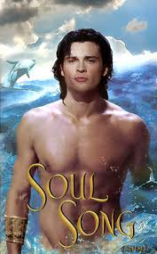
I almost put this in images but the red shirt won out. Really, too much is wrong here. There's also shading and pattern problems.
  • The shading used is too dark, too rough, inappropriate, unnecessary or without adequate gradation. The cover can appear bland, flat or dull.

  • Patterns are sickening to look at. Only in the case of books on illusions or eye tricks will this be a good idea. Potential readers will understand that this is part of the books intent and content. Pattens are also over used so that you can't tell easily one image, item or figure from the next when this isn't required.
  • Depth is either absent, not required or stretched too far. An absence of depth makes the book appear flat and dull while the excess of depth may confuse a potential reader or sicken them as can happen with patterns. Too much depth can also give the impression of over-compensation, like a sales person shoving his wares at you with a brilliant smile and desperate eyes. Also, inappropriate use of depth where none is needed, which is much like the splodging of colour.
  • Text design and placement does not match the story or the genre in any way, whether in line with it or opposing. To draw in a potential reader the elements on the book cover should appear tied together in theme and format unless there is a rare need to show that there is discordance within the story. Even so, there is another design aspect can be used to overlay or establish the discordance. Inappropriate font and placement alone isn't likely to get such a message through.
  • Images used are not tied together correctly, shouldn't be placed together or show a highly improbably scene. Such usage will convey that either the writing is slapdash or the story within isn't going to be very credible. This is as important in fantasy as it is in literature as the likes of fantasy rely heavily on a reader suspending disbelief within very particular parameters. If there is much that is improbable in the cover (a dry person standing in the surf) then the reader will come away with the impression that the story will be improbable, badly constructed and a chore to read.
  • Surprisingly, art is very rarely used on bad covers and this is likely because anything meticulously made cover art is usually made by someone with skills great enough that the story is accurately reflected. Even if it looks like scribble it actually reflects the main character's personality, the state of affairs or the mood of the story. If you see art, whether it is made up of drawings, collages, cartoons, etchings or paintings, you are likely to find a good book within the cover. Still, this is not always the case but blurbs and a quick scan of the first page will likely solve this issue. But if bad art makes it through it practically screams not to go near the book.


Whether you wanted to or not, I'm betting you would have been more interested in the first set of books than the second and yet there is a Kate Elliot and Laurell K Hamilton book in amongst those with bad covers. They might not be your cup of tea but they aren't bad stories.
Cover design does play an important part in our selection and judgment of books so to design good book covers attention must be payed to our instincts and our appreciation of the aesthetic. Discarding such things as a waste of time and effort as the story will convince a potential reader is a very bad thing to do if you want to be successful as either a writer, publisher or designer. Potential readers remain only potential if they aren't drawn in by good looks or curiosity sparked by visual pleasing oddities.

Wednesday, April 18, 2012

Book covers and the sexy poses of men and women

To understand what sparked this post read the Tor post "Hey, Everyone — Stop Taking This Picture! (No, I Mean It.)".

Women do get forced to make such poses in order to sell a show, movie or book. The question is who are the marketers thinking of when they take such pictures? Women? Men? Both? Probably both as they'd like to secure the widest audience possible. But when the audience is likely to be entirely made up of women, no matter the advertising, there are a few problems with marketing pictures like this:


From my experience, they are:
  • A difficulty taking the character seriously as why isn't she on her bike, what reason other than to check her shoe or pick up something would she have to kneel and who kneels to check their shoe in such a pose anyway. Because your initial impression is of the whole product, story included, plausibility in the character is completely lost with one glance at the model used to represent her.
  • An impression that you're about to buy trash. Slapdash covers with women pulling the usual idiotic 'sexy' poses that no one but those in fashion and marketing see actual women do (oh, except on a karaoke dance floor or possibly in those school dance competitions) just give the impression that the character is a cardboard one more concerned with image than surviving whatever challenges are coming her way. I'd be worried that after buying the book I'd find the character as airy as her hair.
  • A niggling concern that the cashier will sneer over it. They might not actually sneer but you know they're thinking "she only reads trash". Peer pressure does count. Just as it works to for force people into buying Harry Potter, Twilight, The Da Vinci Code, Hunger Games, Game of Thrones etc. etc. it works against someone buying a book. If the book looks like one you should tuck under a newspaper as you would buying a porn magazine (if you wonder if I'm being a tad extreme here just wait until you see the romance covers... The only way I'd buy them is online and impersonal. And I'm not a prude. I'm just normal.)
  • If I haven't already bought and liked any of the author's previous works my quick judgment would be that the book probably wouldn't be worth buying (everyone does this, it takes us being consciously aware of our actions for us to turn back and give whatever it is another chance).
  • A nagging worry about whether I'm supposed to be attracted, to be like her or to like her because of her pose that makes me hurry on to easier to approach books.
  • A feeling of uneasiness and of airing dirty secrets when surrounded by dozens of images with women and men posing in unsightly manners sending me skittering away from the entire section if I managed to approach it at all.
  • An inability to browse a section without worrying what other people think of me. (Yes, I was and still am mostly a tomboy so it matters. I have my pride in being on the rough side. Being self conscious of my looks is not for me. Being self conscious of other people's impressions of my mind is. And don't tell me you're not self conscious of anything because I'll just call you a liar.)

Now, you might not have experienced all these or you might have experienced some others instead. Many of those who read romance will defend such images and think I'm being uptight about the genre (I'm not actually, it is the covers and not the material that turns me off the most. Only the more airy-fairy material that presents love as something completely divorced from reality makes me avoid a book like the plague).

But many others will agree that the objectifying of women on book covers has been going a little overboard of late. To me it is annoying as I like a touch of realism in my books, to feel happy and unconcerned buying them and to have the characters within portrayed accurately, especially if they are my favourite kick-arse heroines and heroes.

Is a heroine only a heroine for being sexy and holding guns or knives? No, definitely not.

Oh, and before I move on I have to say that heroines with twig arms holding big guns or heavy swords stretch the believability until I feel nothing but full-blown disgust and irritation. Pick up a sword (not a samurai sword but one of your average European swords) and tell me that any twig-armed girl could lift it and wield it properly. Their wrists would snap with the impact even if they could lift it. Tell me that a twig-armed girl won't have the gun whip back in her face if she pulled the trigger.

I've only met a few twigs who could do this and they were seriously into yoga or martial arts. What was coating those twigs was lean muscle. Soft they were not yet a sword would still have been impractical at their height (most were 5 foot 2 inches to 5 foot 5-ish). Believability, people, characters need believability at least in their physical capabilities.

So, moving on...

I bought Waking the Witch despite the cover as Kelley Armstrong is a great writer armed with some interesting story lines and well-developed female characters. Ones who aren't at all as shown by this cover. The first book in this series is of a lone, rather angry and grudge-filled female werewolf with a huge hatred for the one who made her a werewolf (ends up her husband after many books including bloody mauling/torture/murder scenes), a propensity to strike first and ask for forgiveness later. And she's an adult character, not a teen, thinking on adult problems. That was what convinced me to buy the first book and the strength of the first story carried over to me buying the second. The first cover was more like the below image than the above and it helped to intrigue me, have me believe that my impression of the story from the blurb was accurate and just draw attention in the first place. It stood out from the crowd of objectified women. I purchased the earlier instalments of this series with ease, no qualms about going to the counter and buying them. No feeling that I might be reading trash. Only that giddy little thrill you get from finding another interesting story that you can't wait to read.


Waking the Witch is the latest in the series and stars a young and very powerful daughter of a witch and a sorcerer trying to be good when she wasn't brought up quite like that, getting into all sorts of trouble in the process. In none of the previous books was this girl, now teen, made out to be sexy as portrayed by the cover. Right from the start the character is portrayed incorrectly and I wasn't feeling nearly as content when I bought the book as I had the previous ones in the series. And as it is still on my waiting list, apparently nor am I as keen to read it straight away.


Such turmoil all because so many books marketed at women have cover designs like this:

I bought the first book in the series because the story line intrigued me as her particular brand of creature-species is one not often written about and because Jane seemed a complex character. Turned out she is a fantastic character and the books are awesome. But I'm still annoyed about the poses the model pulls on all the covers in this series. At least she isn't a twig and the leathers and silver armour are usually properly represented. This is THE picture but with a twist, she actually looks mostly capable of kicking your arse.

I wouldn't buy this book unless by force and I mean serious force. I have no idea what the story is about but it doesn't look like anything worth my time, and my spare time to read is becoming increasingly fleeting. This cover just ticked too many boxes on my "not my thing" list, including the implied romance genre, the weak looking woman in need of rescue and the likelihood of too many sex scenes that just make me giggle and snort and wonder why I paid money at all. Oh, and the feathery almost tattoo thing... Geh. This is THE picture.

I know this one is of urban fantasy short stories as Karen Chance and Eileen Wilks are of the authors I follow. This is the reason why I bought it. But I bought the book at a distance (Yay, the Internet) and immediately after reading I shoved it on one of my more hidden shelves where the shameful stuff goes. I don't want everyone coming to my house thinking I only read light nothing (Yes, I realise I just published this on the Internet...). And before I forget, this is THE picture. Again.

On my to read list as I'd ran across her short story in the book Inked. The story, cover-less as the cover of Inked refers to the Karen Chance story, convinced me that Marjorie M Liu can write very well and tackle the urban fantasy genre without resorting to Twiggy or Over-Sexified as the covers suggest. Originally not bought for cover years before, I revised my decision based on the author's skills and bought them. Still, the covers are annoying. How can a self-respecting girl read such books on the train without all the guys (I'm married but I remember the pitfalls of the single life) believing her a little simple and overly concerned with flowery romance? One look and they'd believe her to have unrealistic expectations of what guys should be like and be difficult to be around. Yes, what you read leaves and impression of what you are. Just like what posters or pictures you hang on your wall suggest who you are.

Which leads me to an even worse trend in cover designs. What could be more objectified and for longer? What could be so bad that I will never ever buy a book with a cover of the like in store, never read the book in public without folding back the cover to hide the picture, never clock a book with such a cover out of a library, never shelve the book in any place it can be seen and never recommend it to anyone else. 

What could be worse? The free and indifferent objectifying of men on book covers.

Just because there's a history with women being objectified by men doesn't mean women can objectify men freely and without repercussions. It's like saying "well, you did it first" and believing it a proper justification of your actions.

Oh, the shame! Oh, the humanity! Oh, how much I cringe. Yargh! Naked, tattoo, smouldering over the shoulder look, glowing, contains the word forbidden and to get those muscles you'd have to live in a gym. They aren't worker muscles. They're cheat muscles and don't think I can't tell. Oh, and tans. Why do whitey characters have the skin tones of Greek gods? Aren't whiteys pale, freckled, ghostly, sun burnt red or leather skinned from too much sun? False advertising! I claim shenanigans! If you don't believe me lift the shirt of your nearest white male (one that won't punch you for it) and take a gander at that ghostly pale skin. Talk about these covers building false expectations. You'll only force men into getting skin cancer if you expect then all to be so tanned.


Ditto on all of the above, except this is worse because it doesn't even have the glow to sell it and the images are obviously pasted together. Barely an effort has been made to properly tie the images together. I'm left with the impression the story will be as slap-dash as the cover. Not to mention the can't take it anywhere in public factor.

Shudder.... Fabio returns. At least this time Fabio has a different background.

Did I mention sunburn? Cowboys working in environments such as this would not be shirtless for more than a few minutes if they have any sense of danger when it comes to skin cancer. The burning alone would have stopped most even before skin cancer was a known danger. Definitely a cover folder for all the other reasons.

Tattoos! Bad stick-on tattoos of general generalness that are supposed to say "I'm tough" but end up saying "I'm a d...." (either d word with do). No way, no how, nope. Never, ever. And if you're a guy with one of these tattoos, you have my pity but you also get a slap. You should have known better. Tattoos are personal not things of general generalness.

Ahahahahahahahahahaha! Sorry. Snort. Can't help it. Hehehehehehe. Can't type. Gotta move on or ahahahahahahaha.

I can't figure out if that's a glare or a smile or a smirk or a pout. Am I supposed to be intimidated or impressed or think he's tough? I don't by the way. Everyone I know can glare better than this, except the husband but that's part of why I love him (If he only makes me laugh when he glares then life with him can be fun at all times and the scary factor drops considerably). The attempt at dark, handsome and strong is destroyed by bleach, pouting and an inability to shave. Everyone knows guys don't shave off the stubble only because they're too lazy of a morning, not because they actually care about looking fashionably stubbly. With a carefully placed hand I might be able to read this in public but that's only if I'd managed to buy it.

What the? What is going on with his lower half? Top half is bad enough but what has me staring is what's going on in that green haze... I have no idea why they signed off on this because if it reflects the story in any way it isn't obvious how and all we have left to work with is an overly muscled chest conveniently without chest hair, freckles, pale skin or flab of any quantity.

I hear you, I hear you. No I will not ride you. Go away. Do you ever wonder why women say no? It might be because you tried this in real life. Only the real fools fall for it but I guess if that's what you're aiming for...
As to buying this. No way. Flat out no way.

Ditto. I love the little pointers someone put on this cover. I'm not the only one feeling doubtful and disapproving. In case you don't know what this cover leads to, this book and others like it are for ebook readers only. Porn dressed as... I can't even say literature. Porn dressed as general romance.

And finally, men posed as women used to be. Splayed so that with one push you could knock them over onto whatever they're lying on and have your way with them. Problem is, I just don't want to. Nor do I want to pick up the book because he's so sultry, nor buy it or read it in public or have it on my shelf or recommend it to someone else or borrow it from the library. Using that immortal word: FAIL.

So it isn't just women who get objectified and splayed all over covers. The difference between the two cases (the objectifying of women and the objectifying of men) though, is that rarely are men objectified to men quite so badly as women are to women. In marketing to men, males are featured along the muscular, capable and determined sides. Action heroes staring down whatever challenges them. In marketing to women, females are presented in exactly the same way as they're present to men. Sexualised and in need of help and a good feed even if they are staring down the barrel of whatever challenges them, over the shoulder or otherwise.

Just for fun: to add to Tor's collection of irritating shots of men showing bums and intentionally smouldering is this:

I actually have this book too and feel like I could possibly read it in public. He is fully clothed after all and the setting isn't glowing. No tattoos in sight either and he's not 'glaring' at me, just to the side. This book wasn't bought for the cover but nor was it discounted because there was a horrifying image of a 'sexy' man or woman on it. It is shown openly on my shelf as I don't feel too bad about having the cover looked at and judgments of my reading material made.

On the covers of romance novels men have been subjected to incredible horrors, so much so that reality has been lost completely and most men look about the same: tall, muscled, tanned, dark, handsome, lacking in chest hair, now probably tattooed and possessing of a 'come hither' look dressed as glaring. Just hope they don't glow or have red eyes.

Does it seem like I'm all twisted up over other people's impressions of my reading material? Maybe it does but for books you love, characters you love, you want them shown in the best light possible and you want to be able to recommend the books without that initial impression other people have of the book and you for reading it getting in the way. If you've balked at buying a book because of the cover you'll definitely balk at handing it on with pride. 

Some of you won't care how your covers reflect on the material within but I do. It is the mental image I start the book with and the initial impression I build the character around until proven otherwise. I love covers that are accurate, tasteful, smart, fun, arty and stylish. I don't like covers that downgrade the story, portray men and women shallowly and I don't like buying books with covers that make me cringe in shame and disgust.

Feel free to buy as many as you like but I haven't and won't unless the story is worth the pain. Even then I might chicken out and buy the book online. Thank you Internet!